


From the documents you created in school to the ones you draft as a professional, the go-to font is usually Times New Roman or Calibri. They are popular choices because they are easy on the eyes and simple to read.
With thousands of fonts available today, the options can feel overwhelming. Fonts play an important role in improving readability and helping readers understand information.
In legal documents, fonts go beyond style and appearance. In some cases, the font used in a legal document may need to follow court rules or formatting requirements before it is accepted.
This guide covers the best font styles and sizes for legal documents, including legal fonts for your law firm website. Whether you are preparing digital documents or internal memos, we’ll compare each option so you can choose the right font based on your use case.
Types of Fonts
Fonts can be sorted into a few major groups. Each category has strengths, but the two used most in legal documents are serif and sans-serif. Understanding the differences between them helps you pick the right style for your documents.
Serif Fonts vs. Sans-Serif Fonts
Serif fonts have small decorative strokes at the ends of each letter that give them a traditional look. These strokes help guide the reader's eye along the lines of text. Serif fonts are common in newspapers and legal documents, and they're often required for court filings.
Sans-serif fonts don’t have decorative lines or strokes, giving letters a cleaner look. They have a minimalist design with straight edges that is easy to read on screens, making them commonly used in digital documents, websites, and headings.
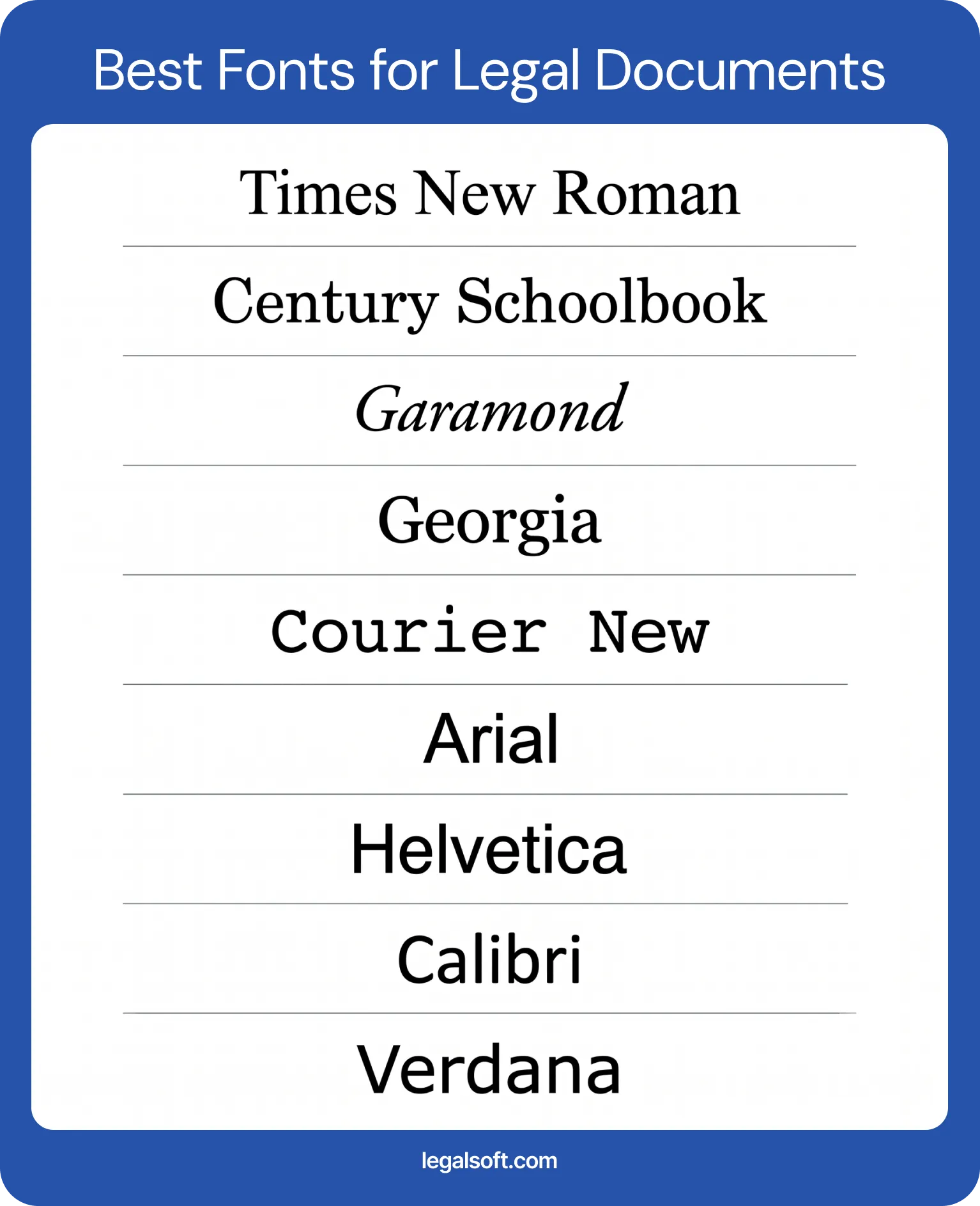
Best Legal Fonts for Legal Documents at a Glance
Top Fonts Used for Legal Documents
The best fonts for legal documents are clear, compliant, and easy to read. Most of your readers will be clients who aren't lawyers. Your font choice shouldn't make their documents harder to read than they already are.
Each font below has its own strength in legal work. Some are commonly accepted or preferred by courts, while others are better for communicating clearly, depending on the type of document you're working on.
Times New Roman
Times New Roman is the font most people picture when they think of legal documents. It was designed by Stanley Morison and Victor Lardent for The Times of London in 1932. It later became the default font in early versions of Microsoft Word, which is largely how it became standard in law offices.
It is highly compact, so it can fit a lot of text within strict page limits and is also accepted by most courts. If you are unsure what font to use, Times New Roman is usually the safe choice.
Century Schoolbook
Century Schoolbook reads cleanly because of its wider character spacing. Many lawyers use it to give documents an authoritative look, and it's one of the fonts preferred by the U.S. Supreme Court.
Its tall and open letterforms hold up well at smaller sizes. It is an ideal font if you practice before the Supreme Court or want a font that signals careful formatting.
Garamond
Garamond is an older serif font known for its elegance and readability across long passages. Its classic design and thinner strokes give a professional look that's comfortable for reading lengthy documents.
Keep in mind that Garamond appears smaller than other fonts at the same point size, so you may need to adjust the size. This has made it less preferred in some courts with strict formatting rules.
Georgia
Georgia is a modern serif font designed for screen readability, which makes it a strong choice for documents meant to be read digitally. As more judges and legal professionals read filings on monitors, this matters. Georgia keeps the traditional feel of a serif font while staying clear across different screen sizes.
It features larger lowercase letters and thicker strokes than many traditional serif fonts. This makes it a great choice for legal documents read on mobile, tablet, or desktop screens.
Courier New
Courier New is a monospaced font where every character takes up the exact same width. It comes from the typewriter era, so it mimics that typewriter look, and it still shows up in some filings and redlines.
Lawyers typically use it for markups, drafts, or transcripts. Some courts require it for pleadings because the fixed spacing makes line and word counts predictable. Federal appellate rules allow monospaced fonts but cap them at 10½ characters per inch under Rule 32.
Arial
Arial is a popular sans-serif font used across many industries. Because of its good screen readability and modern look, you'll usually see it in digital documents, graphics, and emails.
It works well for headings and captions, though serif fonts remain the traditional pick for body text of legal documents.
Helvetica
Helvetica is a sans-serif font with a premium look, which is why graphic designers and branding teams favor it. Its neutral design with geometric lines make it a common choice for law firm letterhead and branding, since it reads as familiar to a lot of people.
Its characters have consistent thickness and tight letter-spacing. But, Helvetica isn't ideal for the body of legal documents, so lawyers often use it more on the marketing materials and presentations.
Calibri
Calibri served as the default font in Microsoft Office from 2007 to 2023, so it’s commonly seen in digital documents and computer screens. It’s a sans-serif font with gently rounded letter ends, giving it a warm,soft look.
Because it reads well in print and on screen, law firms commonly use Calibri for internal documents, memos, and emails.
Verdana
Verdana features wide letter spacing and large lowercase characters designed for screen readability. It is a sans-serif font that works well for modern uses, such as website content and on-screen reading. Its clear spacing also makes it easier to read on digital devices and for people with visual impairments.
It takes up more space than most fonts, so it works better for shorter pieces and is less practical for legal documents with strict page limits.
Best Font Size for Legal Documents
The font style you choose is just as important as the font size you use. Even the right font can be hard to read if the size is too small or not allowed by court rules.
- 12-point: This is the minimum size commonly used for legal documents and is accepted by most courts. When no rule specifies otherwise, 12-point is your safe default.
- 13-point: While less common, some appellate courts and state rules may require or prefer this size to reduce eye strain. It provides a slightly larger layout that makes text easier to scan.
- 14-point: This size is increasingly required by courts that have adopted modern electronic filing rules because of its clearer visibility on screens and helps readers with vision concerns.
Court guidelines vary so always confirm the local rules for your jurisdiction before finalizing your document. Also, make sure the font size works well with the font style you choose. Some fonts have tighter spacing or appear smaller at the same size, which can make the document harder to read.
What Size Paper for Legal Documents
Traditionally, lawyers used 8.5 by 14 inches for legal documents because it gives more space for longer text, signatures, and standard margins. While it's convenient, the standard letter-size paper, 8.5 by 11 inches, is now what most modern court filings require. The 8.5 by 11 size is seen more often on legal materials today than the longer legal-size version.
Why Legal Font Is Important in Legal Documents
Your font choice affects how a document and your law firm are perceived. On the surface, it may seem like a design choice, but it represents your professionalism and how readers view your work.
To give you a clearer idea, here are the three most common reasons why fonts matter in legal documents:
Readability
Legal documents have traditionally lived on paper, so readability was mainly focused on print. But as the legal industry continues to adapt to digital tools and workflows, legal documents now need to be read well both on paper and on screen.
Most legal documents carry long passages across many pages, so your font should help readers follow along and stay focused on the information. A font that's hard to read can cause eye strain and may even lead to confusion or misunderstanding.
Tone and Context
Text is just text, but the style you use can change how it feels to the reader. This is why serif fonts are common in legal documents. They give a traditional and professional feel that can help build trust with readers.
Think of font style like the tone of voice in conversation. It shapes how readers interpret the message, whether it feels formal, casual, modern, or premium. Choose a font that matches the message you want your readers to receive.
Law Firm Branding
Picture your favorite brands. If two companies offered the exact same product, which would you choose? Most of the time you'd pick your favorite, because that brand's identity has already earned a place in your mind.
Font choice works the same way. The typography you use represents how your audience sees your law firm. Using consistent fonts across your legal documents, website, and marketing materials helps build your recognizable identity. It's what sets you apart in the eyes of your readers.
Fonts to Avoid in Legal Documents
Fonts used in legal documents should convey professionalism and stay easy to read. When choosing a font, avoid decorative or script fonts like Comic Sans, Papyrus, and Brush Script, which look out of place in formal work.
You should also avoid overly stylized or condensed fonts that make the text harder to read. It’s better to stick with commonly used legal fonts, like the serif and sans-serif options covered above.
Court-Approved Fonts for Legal Documents
Courts set their own typography rules, and these vary by jurisdiction. Always confirm the requirements before you use it in a legal document.
Supreme Court Font Requirements
For booklet-format documents, the U.S. Supreme Court requires text to use a Century-family font, such as Century Schoolbook, Century Expanded, or New Century Schoolbook under Rule 33. The body text must be 12-point type with at least 2-point leading between lines, while footnotes must be 10-point type or larger.
However, documents filed on standard 8½-by-11-inch paper follow different formatting rules and do not require a Century-family font.
State Court Rules and Requirements
State and lower federal courts set their own rules, and they don't always follow the same font requirements. Some accept any standard serif font, while others name specific fonts and sizes.
For example, Florida appellate rules require computer-generated documents to use either Arial or Bookman Old Style at 14-point, while Minnesota appellate courts require at least 13-point font.
Licensing Fonts for Legal Use
It may surprise you that fonts carry licenses too. Just like other digital products, fonts can be protected by intellectual property rules that control how they can be used across documents, websites, branding, and other materials.
Before using a font, make sure your firm has purchased or licensed it for the intended use. Using unauthorized font files can expose your firm to copyright or licensing claims.
The good news is that many fonts commonly used in legal documents already come with standard operating systems. Fonts like Times New Roman, Calibri, Georgia, and Arial are generally cleared for everyday document work.
5 Tips to Choosing the Right Fonts for Legal Documents

Your legal document font shapes a reader's impression and affects how easily they can read your content. Use these guidelines in considering the font of your choice.
- Check for compliance. Always review and confirm your specific jurisdiction's formatting guideline first. Even if you love a font's design and it fits your image, court rules still come before personal preference.
- Match it to the reading medium. If the document is intended for e-filing or screen reading, a sans-serif is the better choice. Stick with serif fonts for long-form documents that will be read on printed paper.
- Account for strict page limits. Select more tight typefaces like Times New Roman if you need to fit complex text into a strict layout. Avoid widely spaced fonts that can increase your page count.
- Watch for fonts that run small. Two fonts at the same point size can look very different on the page. Garamond, for example, reads smaller than Century Schoolbook, which is why some courts discourage it.
- Stay consistent across the document. Use the same font and size for body text, with a clear hierarchy for headings. Consistent formatting keeps the professional look of your document.
Final Note
Choosing a font may seem like a small decision, but it matters in legal work. The right choice helps your readers understand your document and how professionally your firm is presented.
Because the final choice may depend on court rules, start by checking the approved fonts and formatting requirements for your jurisdiction. From there, use readability and best practices to narrow down your options. What matters most is sticking with a font that helps your document read clearly and gets the information across for your readers.
Manage Legal Documents with Virtual Legal Staff
Getting the details right on every document takes time many lawyers don't have. Legal Soft provides virtual legal assistants and paralegals who become a direct part of your practice and handle document drafting, preparation, and filing tasks.
If you’re ready to stay organized and spend more time on higher-value work, reach out and we’ll match you with the right staff to support your firm.
Frequently Asked Questions
What font should a contract be in?
Contracts often use Times New Roman in 12-point for its clean presentation. But as more contracts are reviewed on screens, some lawyers turn to sans-serif fonts like Arial that read easily across different devices, from phones to desktops.
What font are court documents typed in?
Most courts accept fonts like Times New Roman or Century Schoolbook, typically at 12 to 14-point. Requirements vary by court, so always check the local rules before using a font style or size in your documents.


